Point and Figure Charts: How to Read, Build and Trade Them
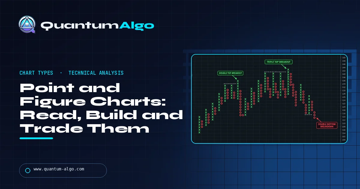
A point and figure (P&F) chart plots only meaningful price moves and ignores time. Rising prices are stacked as a column of Xs, falling prices as a column of Os. Each X or O is one box of a fixed size, and the chart only switches columns when price reverses by a set number of boxes, usually three. The result filters out noise, makes support, resistance and breakouts easy to see, and gives objective buy signals (an X above the previous X column) and sell signals (an O below the previous O column), plus price targets from the vertical and horizontal counts.
Point and figure charts are one of the oldest ways of drawing a market and still one of the clearest. They throw away time and volume, keep only price moves large enough to matter, and turn a noisy chart into a grid of Xs and Os where breakouts are obvious and signals follow fixed rules. This guide explains how the chart is built, how to choose the box size and reversal, the signal patterns worth knowing, how to project price targets and where the method falls short. A free builder below turns any list of prices into a P&F chart with its count target.
Indicators that prove themselves in public.
One engine, four precision tools — the Gold (XAU) Scalper, the institutional Gravity Zone, the Zeno momentum Oscillator, and Zeno Stocks for equities.
What is a point and figure chart?
A point and figure chart (P&F chart) records price moves and nothing else. There is no time axis and no volume. When price rises by a set amount, an X is added to the current column; when it falls by a set amount, an O is added. A column of Xs shows a rally and a column of Os shows a decline. The chart only moves to a new column when price reverses by enough to matter.
The method is older than candlesticks in Western markets. Tape readers in the late 1800s, around the time of Charles Dow, wrote prices in columns of figures to track supply and demand. Victor de Villiers formalised the approach in the 1930s, and A.W. Cohen popularised the three-box reversal chart in the 1940s and 1950s. Later, Thomas Dorsey's book on the subject made P&F the standard tool of many US market technicians, and it is still built into platforms such as StockCharts and TradingView.
Why do traders still use it? Because removing time removes most of the noise. A week of sideways drift that fills a candlestick chart can produce no new boxes at all on a P&F chart, while a decisive breakout shows up as a column that clears the previous high. Support, resistance and trend become a matter of counting boxes rather than eyeballing wicks.
How is a point and figure chart built?
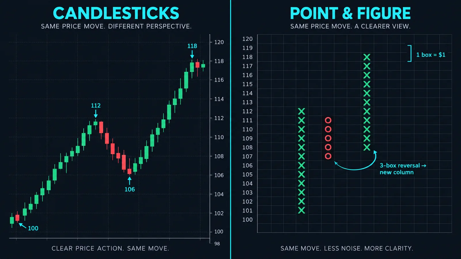
Two settings define every P&F chart:
- Box size: how much price each X or O represents. With a $1 box, a stock must rise a full dollar to add an X.
- Reversal amount: how many boxes price must move against the current column before a new column starts. The classic setting is three boxes.
The building rules are simple. While price keeps rising, add an X for every full box it climbs. If price falls, ignore the move until it drops by the reversal amount (three boxes with a $1 box means $3). Then shift one column to the right and draw Os down from one box below the last X. Continue adding Os while price falls; switch back to Xs only after a three-box rally from the lowest O.
A worked example with a $1 box and a 3-box reversal: price rises from $100 to $108, giving a column of Xs from $101 to $108. It dips to $106. That is only two boxes, so nothing is drawn. It then falls to $104, a four-box drop from $108, so a new column of Os is drawn from $107 down to $104. A rally back to $106 is not enough (two boxes from $104); a rally to $107 is, so the chart moves to a new X column from $105 to $107.
Most charts use closing prices, which keeps the chart simple and avoids reacting to intraday spikes. Some traders use the high-low method instead: check the high first when in an X column and the low first in an O column. The high-low method reacts faster and produces more boxes; the closing method produces fewer, cleaner signals.
How do you choose the box size and reversal?
Box size sets the sensitivity of the chart. Too small and the chart fills with columns of two or three boxes that mean nothing; too large and it takes months to print a signal. There are three common ways to choose it:
| Method | How it works | Best for |
|---|---|---|
| Fixed (traditional) | A set price per box, often stepped by price level, for example $0.50 for stocks between $5 and $20, $1 for $20 to $100, $2 for $100 to $200 | Long-term stock charts that follow the classic Dorsey and Cohen approach |
| Percentage | Each box is a fixed percentage of price, such as 1% or 2%, plotted on a log scale | Assets that have moved a long way in price, and comparing different markets |
| ATR-based | Box size equals the average true range over a lookback, often 14 or 20 periods | Crypto, forex and futures, where volatility changes a lot over time |
The three-box reversal is the standard because it filters most noise while still reacting to real turns. A one-box reversal chart is much more detailed and is sometimes used for short-term work or for counting congestion zones; a five-box reversal is very slow and suits long-term trend following.
A practical rule: pick settings so that a normal pullback in the current trend fits inside one reversal and a genuine change of trend does not. If every minor dip prints a new column, the box is too small. If an obvious trend change never shows up, it is too large. The ATR guide explains how to measure normal volatility for an ATR-based box.
What are the main point and figure buy and sell signals?
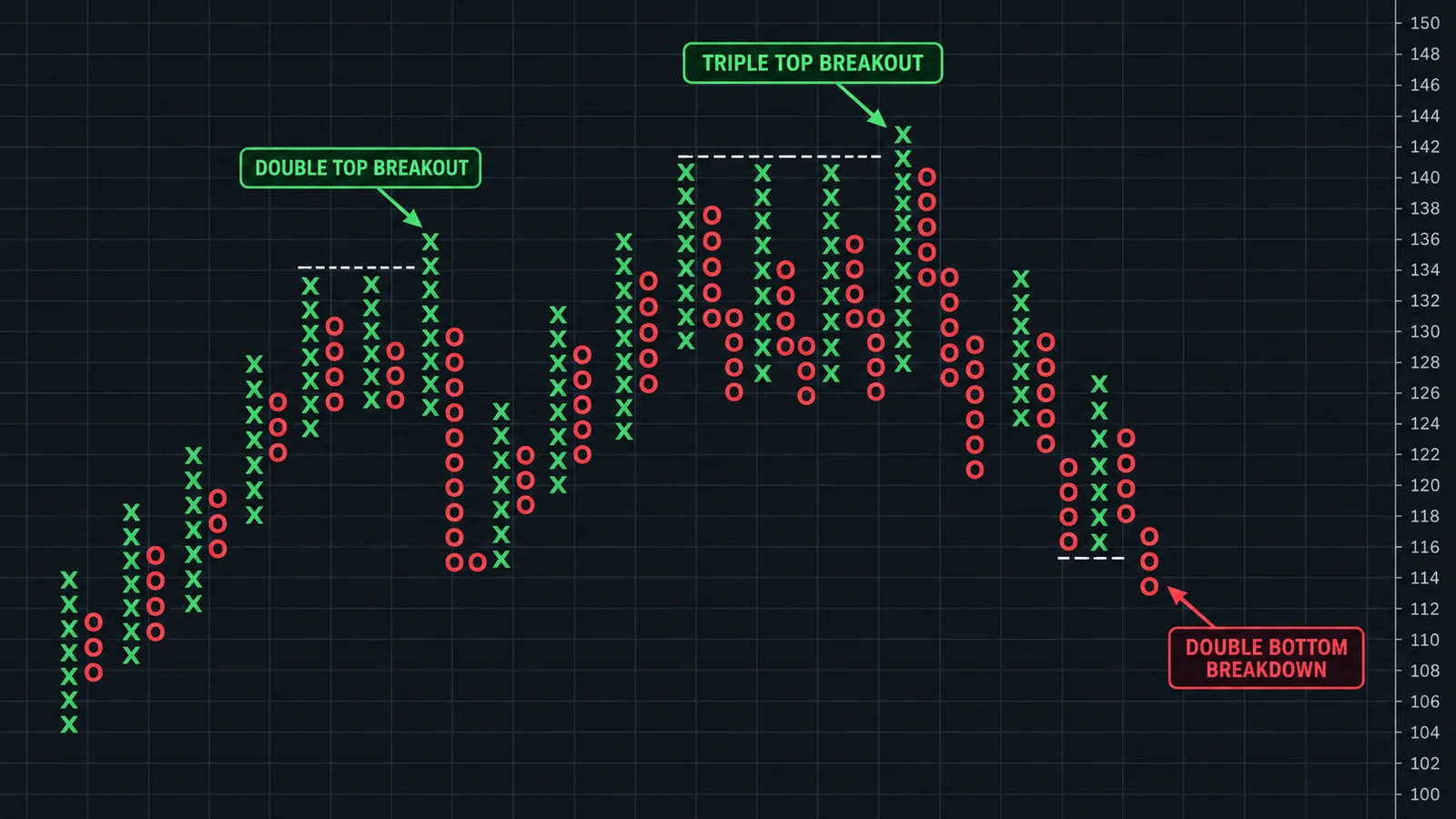
P&F signals are objective: they either happen or they do not, which is one of the method's great strengths. Every signal compares the current column with the previous column of the same type.
| Signal | Rule | Meaning |
|---|---|---|
| Double top breakout | An X column rises one box above the top of the previous X column | Basic buy signal: demand has beaten the last level of supply |
| Double bottom breakdown | An O column falls one box below the bottom of the previous O column | Basic sell signal: supply has beaten the last level of demand |
| Triple top breakout | An X column clears two previous X columns that topped at the same level | Stronger buy signal: resistance tested twice has given way |
| Triple bottom breakdown | An O column breaks below two previous O columns that bottomed at the same level | Stronger sell signal |
| Ascending triple top | Three rising X columns, each topping above the last, with the third breaking out | Rising lows and highs: a trend in good health |
| Bullish catapult | A triple top breakout, a pullback that does not give a sell signal, then a double top breakout | A breakout that held its first test |
| Bearish catapult | The mirror image: triple bottom breakdown, failed rally, then double bottom breakdown | A breakdown that held its first test |
| Bullish signal reversed | A series of higher X and O columns ends with an O breaking below the prior O | Early warning that an uptrend is ending |
Wider patterns carry more weight. A triple top breakout from a base that has been building for months is a more important event than a double top breakout after three columns. That is the same idea as the double top and rectangle patterns on bar charts, but on a P&F chart the levels are exact and nobody has to argue about where a wick ends.
How do trend lines work on a point and figure chart?
P&F trend lines are drawn at 45 degrees, not fitted to price. Because every box is a square, a 45-degree line rises one box per column. That makes trend lines objective too:
- Bullish support line: drawn up and to the right at 45 degrees from below the lowest O of a decline, once a buy signal appears. As long as price stays above it, the long-term trend is up.
- Bearish resistance line: drawn down and to the right at 45 degrees from above the highest X of a rally, once a sell signal appears. As long as price stays below it, the long-term trend is down.
Many P&F traders only take buy signals above the bullish support line and only take sell signals below the bearish resistance line. That single filter removes a lot of counter-trend trades. A break of the line does not always mean an immediate reversal, but it means the trend that justified the position is no longer intact.
Some charting packages also draw internal trend lines and channel lines, but the two 45-degree lines carry most of the value. The bullish percent index, the percentage of stocks in an index that are on P&F buy signals, uses the same logic to measure market breadth, much like the crypto breadth indicator does for digital assets.
How do you set price targets with point and figure?
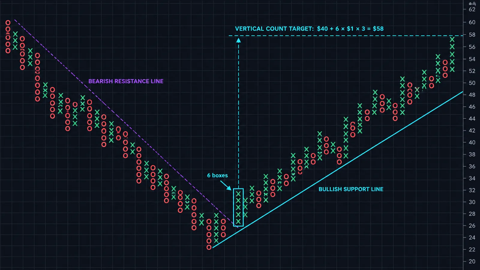
P&F charts are famous for their price targets, called counts. There are two methods.
Vertical count
Take the first X column that rises off a low (or the first O column off a high), count its boxes, and multiply by the box size and the reversal. Add the result to the bottom of the column for a bullish target, or subtract it from the top of the column for a bearish target.
Example: with a $1 box and a 3-box reversal, the first X column off a low rises 6 boxes from $40. The target is $40 + 6 × $1 × 3 = $58. Dorsey's bearish count uses two thirds of the reversal for O columns because declines tend to be faster and shorter, so a 6-box O column from $80 would project $80 − 6 × $1 × 2 = $68.
Horizontal count
Count the number of columns across a base or congestion zone, usually along the row that has the most filled boxes, then multiply by the box size and the reversal. Add it to the low of the base for an upside target. The idea, inherited from Wyckoff, is that the longer a market builds a base, the bigger the move that follows.
Treat counts as guides, not promises. They work best when they agree with other levels, such as previous highs, Fibonacci extensions or major support and resistance. A count that has been exceeded is not a sell signal in itself; it is a reason to tighten risk.
Point and figure chart builder
Paste a list of closing prices, oldest first, and choose a box size and reversal. The builder draws the chart using the closing method, reports whether the latest column has produced a double top breakout or double bottom breakdown, and calculates a vertical count from the latest column. Try changing the box size to see how much the picture depends on it.
How do you trade with point and figure charts?
A simple, rules-based P&F approach looks like this:
- Define the trend with the 45-degree lines. Only look for buys above the bullish support line and sells below the bearish resistance line.
- Wait for a signal: a double or triple top breakout in an uptrend, or the bearish equivalents in a downtrend. Wider bases are better.
- Enter on the breakout or on the pullback. Breakout entries catch every move but pay the worst price. Many traders wait for the next 3-box reversal against the signal and enter there, which improves the entry and the reward to risk.
- Place the stop below the O column that preceded the breakout, or at the level where a double bottom sell signal would appear.
- Use the count as a first target, and trail the stop using the bottom of each new O column as the trend continues.
Because the stop and target are measured in boxes, risk management becomes straightforward. If a trade risks four boxes and the count projects twelve, the reward to risk is 3 to 1 before you place the order. Size the position from the stop distance, as the position sizing guide explains, so that a losing trade costs the same share of your account whatever the box size.
P&F also works well as a filter for other methods. A pullback setup on a candlestick chart is more attractive when the P&F chart of the same market shows a fresh double top breakout above the bullish support line.
What are the limitations of point and figure charts?
- Settings change everything. The same data with a $1 box and a $2 box can show different signals. There is no universally right box size, so test it on the market and timeframe you trade.
- No time information. You cannot see how long a column took to form, which matters for timing options or holding costs. Some platforms write the month number in place of an X or O to keep a rough record.
- No volume. A breakout on thin volume looks the same as one on heavy volume. Pair P&F with a volume tool if participation matters to your method.
- Late entries. Signals need full boxes and reversals, so they come after the move has started. That is the price of filtering noise.
- Whipsaws in ranges. In a sideways market, double top and double bottom signals can alternate. Wider bases and the trend-line filter reduce this but do not remove it.
P&F is a filter on reality, not a prediction. Used with clear settings and the trend filter, it gives some of the cleanest signals in technical analysis; used with random settings, it gives clean-looking noise.
Point and figure vs candlesticks, Renko and Kagi
| Chart | Time axis | What draws a new element | Strength |
|---|---|---|---|
| Point and figure | No | A box move; new column after an N-box reversal | Objective signals, trend lines and price targets |
| Candlesticks | Yes | Every period | Detail on open, high, low, close and timing |
| Renko | No | A brick when price moves one brick size | Very clean trend view; easy trailing stops |
| Kagi | No | A line that changes direction after a set reversal; thickness changes at old highs and lows | Shows supply and demand shifts |
| Heikin Ashi | Yes | Every period, with averaged prices | Smooths candles while keeping time |
Renko is the closest relative: both ignore time and use a fixed price unit. The difference is that Renko draws one brick per move and needs two bricks to reverse, while P&F stacks moves into columns and uses an explicit reversal amount. That column structure is what makes double top breakouts and counts possible. Heikin Ashi keeps time and simply smooths candles.
Point and figure charts and Quantum Algo
Point and figure charts answer one question very well: has price made a move big enough to matter, and in which direction? On TradingView you can switch any chart to P&F from the chart type menu and set the box size (traditional or ATR) and reversal in the settings.
The free Quantum Algo indicators work on standard candles and mark the same ideas the P&F method looks for, such as breakouts of structure, liquidity levels and trend, without having to set a box size. Zeno, the premium engine from Quantum Algo (QuantumAlgo), turns that analysis into signals with an entry, a stop and two targets, and every signal is published on the track record.
A point and figure chart keeps only meaningful price moves: Xs for rises, Os for falls, one box per unit of price and a new column only after a reversal of several boxes, usually three. That removes time and noise and turns signals into rules: a double top breakout to buy, a double bottom breakdown to sell, 45-degree lines for trend and vertical or horizontal counts for targets. The box size decides what the chart shows, so choose it deliberately and test it on your market.
◆ Interactive check
How well do you know point and figure charts?
Questions traders ask about point and figure charts
A chart that plots rising prices as columns of Xs and falling prices as columns of Os, adding a mark only when price moves by a set box size and starting a new column only after a reversal of several boxes. It ignores time and volume.
Read each X column as a rally and each O column as a decline. Compare each column with the previous one of the same type: an X above the prior X column is a buy signal, an O below the prior O column is a sell signal. Use 45-degree lines for the trend.
There is no single best size. Traditional charts use fixed boxes stepped by price, percentage boxes suit assets with large price changes, and ATR-based boxes suit crypto, forex and futures. Choose a size where normal pullbacks fit inside one reversal.
It filters out most small moves while still reacting to real changes in direction. A one-box reversal shows more detail and more noise; a five-box reversal is slower.
Vertical and horizontal counts give a reasonable idea of the potential of a move, but they are not guaranteed. They are most useful when they agree with other levels such as previous highs or Fibonacci extensions.
Yes, with a small box size or intraday data, especially in futures and forex. Signals still need full reversals, so expect fewer, later entries than on a fast candlestick chart.
Yes. Choose Point and Figure from the chart type menu, then set the box size method (traditional or ATR), the reversal amount and whether to use closes or high and low.
Both ignore time and use a fixed price unit. Renko draws one brick per move; P&F stacks moves into X and O columns and uses an explicit reversal amount, which allows double top breakouts and price counts.
The method grew out of tape reading in the late 1800s. Victor de Villiers formalised it in the 1930s, A.W. Cohen popularised the 3-box reversal chart and Thomas Dorsey brought it to a wide modern audience.
References & Related Guides
Read next
- Renko Charts
- Heikin Ashi
- Chart Patterns
- Double Top Pattern
- Double Bottom Pattern
- Support and Resistance
- Breakout Trading Strategy
- ATR (Average True Range)
- Darvas Box
- TradingView Chart Setup
- Free TradingView indicators
- Zeno — the premium engine