Footprint Chart Trading: Reading Order Flow at Every Price
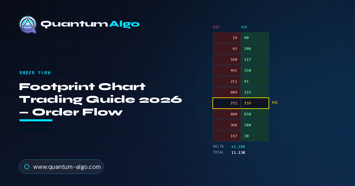
| Tool type | Order-flow chart (volume-at-price, per candle) |
| Shows | Buy vs sell volume at every price inside each bar |
| Best context | Low timeframes, liquid instruments, at key levels |
| Core reads | Absorption, imbalance, exhaustion, unfinished auctions |
| Data needed | Tick-level bid/ask classification |
| Confirmation | Market structure + higher-timeframe context |
1. What Is a Footprint Chart?
A footprint chart is a candlestick that has been opened up so you can see inside it. A normal candle tells you four numbers — open, high, low, close — and its volume tells you how much traded. It cannot tell you where inside the candle that volume happened, or whether buyers or sellers were the aggressors at each price. A footprint chart answers exactly those questions. It shows, for every individual price level the candle traded through, how much volume executed on the bid versus the ask.
That is the whole idea: instead of one candle body, you get a stack of price rows, and each row carries two numbers — the volume that traded at the bid (aggressive selling) and the volume that traded at the ask (aggressive buying) at that price. Read top to bottom, a single footprint candle is a complete transcript of the fight that produced it.
The image below is a live BTCUSDT footprint. Each column is one candle; each cell shows bid volume on the left and ask volume on the right; the footer under each candle sums up its delta and total volume. This is order flow at its highest resolution — nothing is aggregated away.
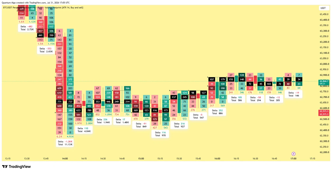
Look at that large down candle for a moment, because it demonstrates why footprint matters. Its footer reads −1.28K delta on 11.13K total volume. A normal chart would show you a big red candle and a tall volume bar — informative, but blunt. The footprint tells you the sellers won by 1,280 contracts of aggression, and it shows you at exactly which prices that selling concentrated. That is the difference between knowing a candle was bearish and knowing how it was bearish.
2. Anatomy of a Footprint Candle
Before you can read patterns, you need to read a single cell fluently. Here is the standard bid-x-ask footprint, cell by cell.
Bid × Ask cells
Every price row shows two numbers. The bid number is volume that traded at the bid — aggressive market sells hitting resting buyers. The ask number is volume at the ask — aggressive market buys lifting resting sellers. This is the atomic unit of the whole chart.
Point of Control (POC)
The single price row inside the candle with the highest total volume. It marks where the most business was done — a magnet and a reference level. A POC printing at the extreme of a candle carries different meaning than one in the middle.
Imbalance
A row where one side dwarfs the diagonally-opposite side by a large ratio (commonly 3:1 or more). Stacked imbalances on one side reveal where aggressive flow was one-directional and often mark levels price defends or rejects later.
Delta & Total footer
Delta is ask volume minus bid volume for the whole candle — net aggression. Total is the sum of all volume. Together they compress the candle's story into two numbers, the same numbers that build cumulative delta when strung together.
3. The Core Footprint Patterns
Once you can read a cell, the patterns are combinations of cells that recur at meaningful turning points. Five carry most of the weight.
Absorption
Heavy volume on one side that fails to move price. Aggressive sellers keep hitting the bid — big left-side numbers, row after row — yet price refuses to fall because a large passive buyer is absorbing every sell. When the sellers exhaust and price holds, that absorption often marks a low. Absorption is the single most important footprint read, and it is the same event as the delta divergence you would see on a CVD panel — here you see it at the exact price it happened.
Stacked imbalances
Several imbalanced rows in a row, all favouring the same side. Stacked buy imbalances mark a zone of one-directional aggressive buying; price often returns to defend it. Traders use stacked imbalances to build support and resistance from order flow rather than from price alone.
Exhaustion / trapped traders
A candle pushes to a new extreme with a burst of aggression, but the next candle shows that aggression evaporating — small opposite delta, price failing to follow through. The aggressors at the extreme are now trapped, and their stops become fuel for the reversal. This is exhaustion at the tape level, visible before price confirms it.
Unfinished auctions
When a candle's high or low prints with volume on both bid and ask at the extreme price, the auction is "unfinished" — the market did not cleanly reject that level. Price tends to return to finish it. A finished auction, by contrast, shows a single-sided print at the extreme.
Delta flips at levels
A candle's delta flipping from strongly negative to positive (or vice versa) exactly at a known support, resistance or order block is confirmation that the level is being defended by real aggressive flow, not just resting orders. This is where footprint and Smart Money Concepts meet.
4. Reading Delta, POC and Volume Together
A footprint candle gives you three layers of information at once — delta, point of control, and total volume. The skill is combining them, because each one alone can mislead and the three together tell a coherent story.
Delta tells you who won the aggression battle. POC tells you where the market agreed on value. Total volume tells you how much conviction was behind it. Consider how differently the same red candle reads under different combinations:
| Delta | POC location | Volume | What it suggests |
|---|---|---|---|
| Strong negative | Near the low | High | Genuine aggressive selling with conviction — continuation likely |
| Strong negative | Near the high | High | Heavy selling absorbed up high — possible bull trap forming |
| Weak / flat | Middle | Low | No conviction — a pause, not a signal |
| Positive on a down candle | Any | High | Delta divergence — buyers stepping in as price falls |
That second row is the one worth dwelling on. A big red candle with strongly negative delta looks bearish — and a normal chart would read it that way. But if its POC sits near the high of the candle, it means all that aggressive selling was absorbed up at the top and could not push price's centre of gravity down. That is not strength; it is selling that got trapped. The footprint shows you the trap while a candlestick chart would have you shorting into it.
The delta-divergence-at-price advantage
The reason footprint traders tolerate the cost and complexity is precision. On a CVD panel, a bullish divergence tells you buying pressure is returning somewhere in the recent swing. On a footprint, you see the exact price rows where aggressive selling died and absorption began. That precision lets you place a stop just beyond the absorption zone rather than beyond the whole swing — a materially tighter, better-defined risk.

Automate your trades. Let Quantum Algo trade for you.
Every signal executed on your own account — 24/7, hands-off.
5. Where Footprint Traders Go Wrong
Footprint is the most detailed order-flow tool, and that detail is exactly what trips people up. More data is not automatically more edge. These are the mistakes that turn a powerful tool into an expensive distraction.
Mistake 1 — Drowning in detail
A footprint chart is overwhelming at first: hundreds of numbers per screen. Beginners try to read every cell and end up paralysed or, worse, find a pattern in random noise. The fix is discipline: only read footprint at levels you already care about. Mark your support, resistance and order blocks first, then use the footprint to judge what is happening as price interacts with them. Everywhere else, the detail is noise.
Mistake 2 — Ignoring the higher timeframe
Footprint lives on low timeframes, where a single absorption or exhaustion pattern can look decisive while meaning nothing in the context of a strong daily trend. A bullish absorption on the 1-minute during a hard daily downtrend is a bounce to fade, not a bottom to buy. Footprint times entries; it does not set direction. The higher timeframe sets direction.
Mistake 3 — Trusting it on thin markets
Footprint is only as reliable as the bid/ask classification underneath it, and that classification degrades on illiquid instruments. On thin altcoin perps or exotic pairs, the buy/sell tagging is noisy and the imbalances you see may be artefacts. The tool belongs on liquid markets — BTC and ETH perps, ES, NQ, high-volume forex — where there is enough flow for the numbers to mean something.
Mistake 4 — Confusing single-venue with market-wide flow
A footprint from one exchange shows that exchange's flow only. On fragmented crypto markets, a big imbalance on one venue can reflect where a single participant chose to execute rather than a market-wide event. Where possible, cross-check against aggregated flow before treating a single venue's footprint as gospel.
Mistake 5 — Using it as a standalone entry trigger
Like every order-flow read in this series, a footprint pattern is a reason to expect something, not a reason to click. Absorption at a level still needs a market structure break to confirm the reversal has begun. Entering on the absorption alone means entering while the original move may still be in control — and absorption can last longer than your stop.
Read the footprint
Four footprint candles below, each with bid (left) and ask (right) cells and a delta footer. Click the candle showing absorption — heavy selling that failed to push price down.
6. Four Ways to Trade With Footprint Charts
Footprint is a lens, not a system — but it slots into several proven approaches. Here they are, from most robust to most demanding.
1 — Absorption reversal at a level
The flagship setup. Price reaches a level you have marked — prior swing, order block, value-area edge — and the footprint shows absorption: heavy aggressive volume on one side that fails to move price. You wait for the aggression to exhaust and a market structure break to confirm, then enter in the reversal direction with a stop just beyond the absorption zone. This is footprint's highest-probability use because the tool is doing what it does best — showing you a passive participant winning a fight the tape says they were losing.
2 — Imbalance support and resistance
Instead of drawing levels from price alone, you build them from stacked imbalances — zones where aggressive flow was heavily one-directional. Price frequently returns to these zones and reacts. Used this way, footprint gives you order-flow-based levels that are invisible on a standard chart, and they often prove more precise than swing-based levels because they mark where real aggression, not just a wick, occurred.
3 — Trapped-trader continuation
When a footprint shows exhaustion at an extreme — a burst of aggression that immediately fails — the traders who entered at that extreme are trapped. Their stops sit just beyond the level, and when price runs them, it accelerates. You position for that acceleration: fade the exhaustion, targeting the trapped traders' stops as your first objective. This is an aggressive, low-timeframe play that rewards fast reading.
4 — Footprint-confirmed SMC entries
The synthesis. You run a Smart Money Concepts framework — liquidity sweep, order block, fair value gap — and use the footprint purely as final confirmation at the point of entry. Price sweeps liquidity into your order block; the footprint shows a delta flip and absorption right there; you enter. Here footprint is not the strategy — it is the last checkbox that upgrades a good SMC entry into a high-conviction one. For most discretionary traders, this is the most practical way to use it.
7. Setting Up Footprint Charts
Footprint has a higher barrier to entry than the other order-flow tools in this series, and it is worth being honest about that before you invest time in it.
You need tick-level data. A footprint chart is built from individual trades classified as bid or ask. That requires a data feed granular enough to see every trade — not the aggregated candle data most charts run on. For crypto, several platforms provide this for major perpetuals; for futures like ES and NQ, it comes through the exchange's tick feed via dedicated order-flow software.
You need software that renders it. Footprint is not a standard chart type everywhere. TradingView offers footprint/volume-footprint chart types on higher plan tiers, and dedicated order-flow platforms specialise in it with more configuration. The chart shown throughout this guide is a Bybit-fed footprint rendered exactly as you would use it.
Use very low timeframes
Footprint's edge is intrabar detail, which only exists on low timeframes. 1-minute, 5-minute, or tick/volume/range bars are where it lives. On anything higher, each candle aggregates so much flow that the cell-level detail blurs. The chart here is a low-timeframe view for exactly this reason.
Set an imbalance threshold
Configure what ratio counts as an imbalance — 3:1 is a common default. Too low and everything highlights; too high and you miss real signals. Tune it to the instrument's typical flow so the highlights mean something.
Mark levels before you look
Draw your support, resistance, order blocks and value edges first. Then read footprint only where price meets them. This is the single habit that separates traders who profit from footprint from those who drown in it.
Prefer liquid, aggregated flow
Stick to liquid instruments, and where a platform offers aggregated footprint across venues, prefer it. On fragmented markets a single exchange's footprint can mislead. Liquidity is what makes the bid/ask classification trustworthy.
Is it worth it? For most traders, the honest answer is that footprint is a graduation tool. Start with cumulative delta and delta divergence, which give you most of the order-flow read at a fraction of the cost and complexity. Move to footprint when you are trading low timeframes actively enough that price-level precision changes your results. It is a scalpel — indispensable for the surgeon, overkill for a paper cut.
8. Test Your Knowledge
Seven questions covering footprint anatomy, patterns, and how to trade them.
9. Combine Footprint With Smart Money Concepts
Footprint shows you the aggressive flow at every price. Smart Money Concepts show you which prices matter and when a level has actually flipped. They are the microscope and the map — and used together they are far more than either alone.
The confluence is exact. Smart Money Concepts identify a liquidity pool above a swing high and an order block below; price sweeps the liquidity and taps the block. That is the map. The footprint is the microscope you point at the block the moment price arrives: does the delta flip? Is aggressive selling being absorbed? Do stacked buy imbalances print? If the flow confirms, you have an SMC entry validated at the tape level — the highest-conviction setup available to a discretionary trader.
• Buy/sell signals with built-in SL and TP — the structural entries a footprint confirms at the tape
• Tidal Force momentum confirmation — reads the same absorption and exhaustion footprint reveals cell by cell
• Order block and FVG detection — the exact levels to point the footprint at
• Liquidity sweep mapping — so you know where trapped traders' stops sit
• Multi-timeframe confluence scoring — so a 1-minute footprint read is checked against the trend that matters
• ATR-based risk management — stops placed just beyond the absorption zone, sized to volatility
The habit to build: use structure to find the level, then use footprint to confirm the flow there. Never the footprint alone — that is how you drown in numbers. Never the structure alone at a decisive moment — that is how you miss the trap the tape was showing you.
Frequently Asked Questions
A footprint chart is a candlestick chart that shows the buy and sell volume traded at every individual price level inside each candle. Where a normal candle gives you only open, high, low, close and total volume, a footprint shows, for each price the candle traded through, how much volume executed at the bid (aggressive selling) versus the ask (aggressive buying). It is the highest-resolution view of order flow available.
Read each price row as two numbers: the bid volume (aggressive market sells hitting the bid) and the ask volume (aggressive market buys lifting the ask). The point of control is the row with the most total volume. An imbalance is a row where one side heavily outweighs the diagonal opposite. The footer under each candle sums delta (ask minus bid) and total volume. Combine these to see who was aggressive, where the market agreed on value, and how much conviction was behind the move.
The point of control is the single price row within a footprint candle that traded the most total volume. It marks where the most business was done and acts as a reference level and a magnet. Its location within the candle matters: a POC near the low of a down candle suggests genuine selling, while a POC near the high of a down candle suggests selling was absorbed up high and may be trapped.
Absorption is heavy aggressive volume on one side that fails to move price, because a large passive participant is soaking it up with limit orders. On a footprint you see it as big bid (or ask) numbers stacking row after row while price stalls at a level. When the aggressive side exhausts and price holds, absorption often marks a reversal. It is the same event as a delta divergence on a CVD panel, shown at the exact price it occurred.
Both show order flow, but at different resolutions. Cumulative volume delta (CVD) is a single running line summarising net aggression over time, read in a lower panel. A footprint chart shows the underlying bid/ask volume at every price inside every candle. CVD tells you buying pressure returned somewhere in a swing; a footprint tells you the exact price rows where it happened. CVD is cheaper and simpler; footprint is more precise and more demanding.
Footprint works best on liquid instruments with clean trade classification — BTC and ETH perpetuals, major index futures such as ES and NQ, and high-volume forex — and on low timeframes where intrabar detail exists, such as 1-minute, 5-minute, or tick, volume and range bars. On thin instruments the bid/ask classification is noisy, and on high timeframes each candle aggregates too much flow for the cell-level detail to be useful.
Yes. TradingView offers footprint and volume-footprint chart types on higher plan tiers, which render bid/ask volume at price with delta and total footers. Dedicated order-flow platforms provide footprint with more configuration and, for futures, direct exchange tick feeds. Either way, footprint requires tick-level data granular enough to classify every trade as a buy or a sell.
For most beginners, not yet. Footprint is a graduation tool — its price-level precision only changes your results if you are actively trading low timeframes. A better starting point is cumulative volume delta and delta divergence, which deliver most of the order-flow read at a fraction of the cost and complexity. Move to footprint once the simpler tools are second nature and you need tighter, price-exact entries.
More guides
References & Related Guides
More in this topic
- Bookmap Review (2026): The Order-Book Heatmap, and What It Actually Shows a Smart Money Trader
- Cumulative Volume Delta (CVD): Complete Guide 2026
- Market Profile Trading: Complete Guide 2026
- Order Flow Trading 2026 - Read the Footprint of Institutions
- Delta Divergence 2026 - When Price and Order Flow Disagree
- Volume Profile Trading Guide 2026 - POC, VAH & VAL
- VWAP 2026 - Complete Volume Weighted Average Price Guide
- What Are the Best Volume Indicators? (2026)
- Wyckoff Method 2026 - Complete Institutional Trading Guide
- Scalping Trading Strategy: Complete Guide (2026)
- Day Trading Strategies 2026 - The Complete Profitable Guide
- Liquidity Trading Guide 2026 - Raids & Kill Zones
- Liquidity Sweep Trading: Stop Hunts Explained (2026)
- Support & Resistance: Complete Trading Guide (2026)
- Funding Rate Trading Guide 2026 - Perpetual Futures
Core reading
- Delta Divergence 2026 - When Price and Order Flow Disagree
- Order Flow Trading 2026 - Read the Footprint of Institutions
- Volume Profile Trading Guide 2026 - POC, VAH & VAL
- Smart Money Concepts: The Complete Trading Guide (2026)
- Risk Management in Trading 2026 - Complete Guide
- All Premium Guides
- Quantum Algo on TradingView
- Public Verified Track Record