Bitcoin Power Law: What the Model Says, What It Doesn't, and How a Trader Uses It
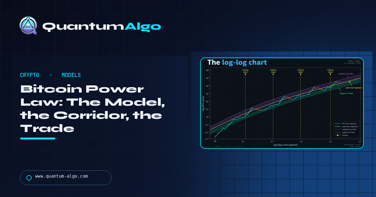
The Bitcoin power law is a model that says Bitcoin's price has grown as a power of time — price ≈ A × (days since genesis)^n with n near 5.8 — so that on a log-log chart the whole history sits close to a straight line inside a corridor that has contained nearly every price since 2010. Proposed by physicist Giovanni Santostasi, it describes the past rather than guaranteeing the future, but because it has held it gives a trader a corridor of where price is cheap, fair or expensive relative to trend — bias, never timing.
Every cycle produces a model that claims to know Bitcoin's price; most are retired after the next cycle. The power law is the one that has stayed inside its own corridor for fifteen years, which is why it deserves a careful page rather than a dismissal or a cult. This is the model, the log-log chart, the corridor as a trader reads it, the honest case for and against, the comparison with stock-to-flow and the rainbow chart, how a structure trader uses it one level above the weekly chart, and the arithmetic. The calculator below places today's price in the corridor.
Indicators that prove themselves in public.
One engine, four precision tools — the Gold (XAU) Scalper, the institutional Gravity Zone, the Zeno momentum Oscillator, and Zeno Stocks for equities.
What is the Bitcoin power law?
The Bitcoin power law is a model that says Bitcoin's price has grown as a power of time — price ≈ A × (days since genesis)^n, with n close to 5.8 — so that when both price and time are plotted on logarithmic scales the entire history falls close to a straight line, with a corridor around it that has contained nearly every price since 2010. Proposed by physicist Giovanni Santostasi, it is a description of the past that has held for fifteen years, not a mechanism that guarantees the future; but because it has held, it gives a trader something useful: a corridor of where price is expensive, fair and cheap relative to its long-run trend, without pretending to know when it moves. This guide is the model, the honest case for and against it, and the way a structure trader actually uses it — as bias, never as timing.
The log-log chart
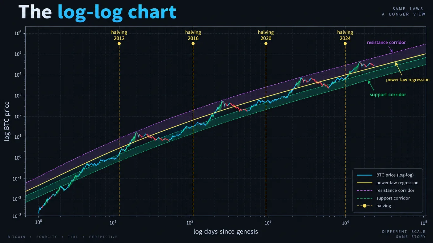
The chart illustration in this guide is the model in one picture: the horizontal axis is days since the genesis block on a log scale, the vertical axis is price on a log scale, and Bitcoin's price history sits along a straight regression line with a corridor above and below it. The halvings are marked as vertical lines — they fall on the chart without breaking the line, which is one of the model's arguments that the cycle is a wobble around a trend rather than the trend itself.
Why log-log: on a normal chart Bitcoin's history is unreadable — early prices are a flat line at zero, the 2021 peak dominates everything. On a log price scale each doubling is the same distance, which is the usual fix. The power law goes one step further and makes time logarithmic too, because a power-law relationship y = A·xⁿ becomes a straight line only when both axes are logarithmic. The slope of that line is the exponent n; fitted to Bitcoin's history it comes out near 5.8, which means a tenfold increase in time has produced roughly a 630,000-fold increase in price.
The corridor: floor, fair value, ceiling
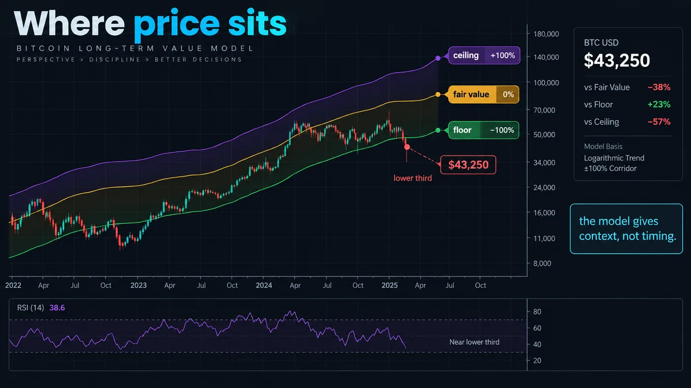
The zoomed illustration in this guide shows the corridor as percentages around the regression line. The lower band — the floor — has been touched at the bottom of each bear market and never broken for long; the upper band — the ceiling — has been reached at each cycle peak and never held. The regression line itself is the model's "fair value", the price the trend would give without the cycle. The callout on the illustration is the point of the page: the model gives context, not timing. Price can sit in the lower third of the corridor for a year; the model says only that it is cheap relative to trend, not that it will rise next month.
Read as a trader: near the floor — historically the deepest value; the place long-term accumulation has paid; a swing trader's bias is long. Near the line — fair; no bias from the model. Near the ceiling — historically the cycle peak; a swing trader's bias is caution, and the model has never yet been wrong about the ceiling holding, which is exactly why it will be wrong loudly if it ever is.

Automate your trades. Let Quantum Algo trade for you.
Every signal executed on your own account — on your account, with the plan you define.
What the model does and does not claim
Does claim: that Bitcoin's price has followed a power law of time for its entire history, that the corridor has bounded the cycles, and that if the relationship persists the corridor projects forward. Does not claim: that the relationship must persist, that the cycle timing is predictable, that any given month's price is predictable, or that the exponent is a law of nature. Santostasi's own framing is that power laws describe many growing networks, that Bitcoin's is unusually clean, and that the model should be judged by whether the future stays in the corridor.
The honest objections: fifteen years is one regime; the fit is dominated by early data when Bitcoin was tiny; a log-log straight line can be fitted to many growth processes that later broke; and the model is unfalsifiable on short horizons because a "wobble" can be years long. All true. What the objections do not change is that, for a trader who wants a long-run reference for whether price is cheap or expensive, the corridor has been a better reference than most.
Power law versus the other models
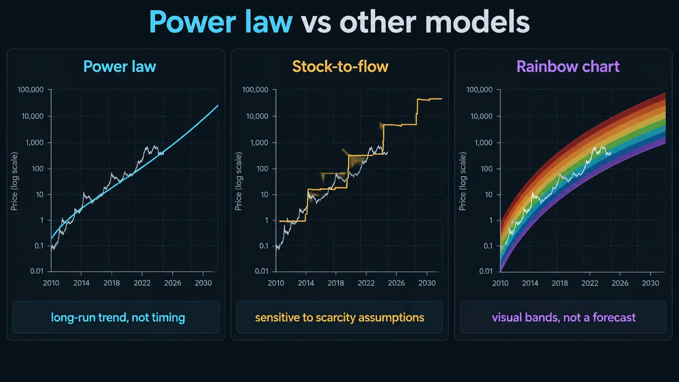
The three-curve illustration in this guide compares the models traders see most:
- Power law — price as a power of time; a straight line on log-log; the corridor has held since 2010. Claims context, not timing.
- Stock-to-flow — price as a function of scarcity (supply ÷ new issuance); predicted six figures by 2021 and was wrong; the model's author eventually stopped publishing the chart. Its failure is the reason the power law's modest claims matter.
- Rainbow chart — a logarithmic regression with coloured bands; a fun chart without a stated mechanism; useful for the same "cheap or expensive" read, less rigorous than the power law and with bands that have been redrawn over the years.
Read all three as sentiment tools at best. Only the power law states a relationship, stakes a corridor and has not yet had to move it.
How a structure trader uses it
The model is a higher-timeframe bias, one level above the weekly chart. In practice:
- Check the corridor position once a month. Lower third: long bias for swing trades, accumulation for holders. Middle: no bias from the model. Upper third: reduce swing-trade size, take profits at structure, no new long-term accumulation.
- Trade the structure inside that bias. The Smart Money setup — sweep, change of character, retest of the order block — on the daily and 4-hour charts, in the direction the corridor favours. Zeno's regime labels on the 2-hour chart give the entries; the power law gives the reason to prefer one side.
- Never time with it. The corridor does not say when; sitting near the floor for a year is normal. Entries come from the chart.
- Size by risk, not by the model's confidence. A position that is right about the corridor and wrong about the next quarter still needs a stop and a size that survives it; the position-sizing guide has the rule.
The position calculator on this page takes today's price and date and returns where price sits in the corridor.
The arithmetic, for the curious
With t = days since 3 January 2009 and the published fit, fair value ≈ 10^(−17.0) × t^5.8 — the constants vary slightly between published fits, and the exponent between about 5.7 and 5.9. The corridor bands are the same formula scaled by a constant factor above and below (roughly 0.4× for the floor and 2.5× for the ceiling in most fits). Because the exponent is applied to time, fair value grows more slowly every year in percentage terms — the model implies diminishing returns per cycle, which is the other thing it got right about 2021 relative to 2017.
Reading the corridor through a cycle
A full cycle on the log-log chart looks like this. Coming out of a bear-market low, price sits on or near the floor for months — 2015, 2018–2019, late 2022 — while the model's fair value keeps rising, so price is cheapest relative to trend at the moment sentiment is worst. As the cycle turns, price crosses the regression line — fair value — usually a year or more after the low. It then runs toward the ceiling in the euphoric phase, touches or approaches it, and the peak arrives; every cycle so far the ceiling has held, and every cycle the touch has lasted weeks, not months. The bear market brings price back through fair value and, at its end, to the floor again. The corridor is the same each time; what changes is the time between touches, which the model says grows with the exponent.
The corridor position is therefore a slow variable: it changes meaningfully over quarters, not weeks. That is what makes it a bias, not a timing tool, and it is why checking it once a month is enough.
What would falsify the model
The model's own test is simple and public: price closing below the floor and staying there for an extended period would mean the relationship has broken; price rising above the ceiling and staying there would mean the exponent has changed. Neither has happened in fifteen years. Santostasi has also argued that a break of the floor without a return within a couple of years would be a genuine falsification rather than a wobble. A trader should treat either as a regime change and drop the bias until a new relationship has years of evidence — which is exactly the discipline the quantitative trading guide asks for any model.
The power law and the halving cycle
The two are often presented as rivals; they are not. The halving is a supply event on a four-year schedule; the power law is a demand-and-adoption description over the whole history. The cycle shows up on the log-log chart as the oscillation around the line — peaks after halvings, floors between them — and the power law shows up as the line the oscillation orbits. Diminishing returns per cycle, which the halving model alone does not explain, fall out of the power law's exponent naturally: each cycle's gain from floor to ceiling is a smaller multiple because the same corridor width is applied to a slower-growing trend. Neither model tells you when the next peak is; together they say roughly how far and roughly how much less than last time.
A straight line on log-log, a corridor that has held since 2010, and a claim modest enough to have survived: cheap, fair or expensive relative to trend. Check the corridor once a month, let it tilt the swing bias, take every entry from structure, and size by risk — and if price ever leaves the corridor and stays out, drop the model the way any model should be dropped.
◆ Interactive check
Do you know what the model claims?
Questions people ask about the Bitcoin power law
Physicist Giovanni Santostasi, who published the fit and the argument that Bitcoin's price scales as a power of time; the observation that Bitcoin's history is a straight line on a log-log chart had been made by others earlier.
A corridor, not a price: if the relationship persists, fair value follows the regression line into the future and price stays between the floor and the ceiling. It does not predict when price moves inside the corridor.
It has described fifteen years of history within its corridor without the corridor being redrawn, which is more than stock-to-flow or the rainbow chart can say. Whether it continues is exactly the question the model cannot answer.
Stock-to-flow models price from scarcity and failed publicly in 2021–2022; the power law models price from time, makes a narrower claim (a corridor), and has not failed yet.
Use it as a bias one level above the weekly chart — cheap or expensive relative to trend — and take entries from structure. Timing from the model is the mistake.
Not in the indicators; Zeno reads structure. We use the corridor the way this page describes — as a long-run bias for the crypto slice — and the track record's crypto calls are structure entries inside it.
Price ≈ A × t^n with t the days since the genesis block (3 January 2009) and n around 5.8; the constant A and the corridor multipliers vary slightly between published fits, which is why the calculator lets you set them.
No. The rainbow chart is a logarithmic regression with coloured bands and no stated mechanism, and its bands have been redrawn; the power law states a relationship and has not moved its corridor.
Use the calculator with today's price and date; the answer is a position between floor and ceiling, and it changes over quarters rather than weeks.
It projects a corridor if the relationship persists — which is the assumption the model cannot prove. Treat any single-number "prediction" derived from it as a fair-value line, not a forecast.
Fits have been attempted; none has Bitcoin's fifteen-year clean history, and most altcoins have broken any corridor drawn for them. Treat those fits as curiosities.
Not inside the indicators — Zeno reads structure. We use the corridor as a long-run bias for the crypto slice, the way this page describes, and the track record's crypto calls are structure entries inside it.
References & Related Guides
Read next
- Bitcoin Dominance Explained
- Altcoin Season Explained
- Day Trading Crypto
- What Is Quantitative Trading?
- Swing Trading vs Buy-and-Hold
- Liquidation in Trading
- Liquidation Magnet (free indicator)
- Quantum Algo Track Record